body { font-family: ‘Market Sans’, Arial, sans-serif; }
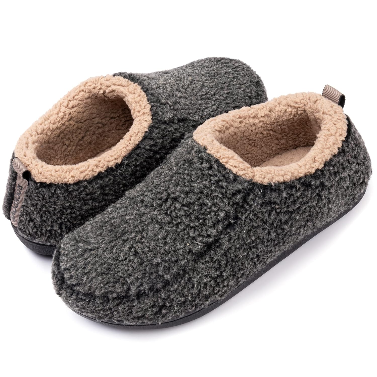
Designed For Contoured ComfortMake a comfy Crocs statement with the Crocs Baya Clog. A twist on the signature Classic Clog, it features the lightweight, durable build you love with advanced ventilation for breathability and to help drain water and debris. Our new marbled Croslite™ foam creates a colorful effect that is completely unique. While all marbled shoes have the same wavy look, no two shoes are exactly alike
@media only screen and (min-width: 920px) { .u-row { width: 1200px !important; } .u-row .u-col { vertical-align: top; } .u-row .u-col-100 { width: 1200px !important; } } @media only screen and (max-width: 920px) { .u-row-container { max-width: 100% !important; padding-left: 0px !important; padding-right: 0px !important; } .u-row { width: 100% !important; } .u-row .u-col { display: block !important; width: 100% !important; min-width: 220px !important; max-width: 100% !important; } .u-row .u-col > div { margin: 0 auto; } .u-row .u-col img { max-width: 100% !important; } .no-stack .u-col { min-width: 0 !important; display: table-cell !important; } .no-stack .u-col-100 { width: 100% !important; } } body{margin:0;padding:0}table,td,tr{border-collapse:collapse;vertical-align:top}p{margin:0}.ie-container table,.mso-container table{table-layout:fixed}*{line-height:inherit}a[x-apple-data-detectors=true]{color:inherit!important;text-decoration:none!important} @media (min-width: 0px) { .hide-default__display-block { display: block !important; mso-hide: unset !important; } .hide-default__display-table { display: table !important; mso-hide: unset !important; } } @media (max-width: 480px) { .hide-mobile { max-height: 0px; overflow: hidden; display: none !important; } } @media (min-width: 481px) { .hide-desktop { max-height: 0px; overflow: hidden; display: none !important; } } table, td { color: #000000; } #u_body a { color: #80c142; text-decoration: underline; }
|
#custom-nav-eghj0ce2 li a:hover { background:#80c142 !important; color: #fff !important; border-top:0px solid #d80027 !important; border-right:0px solid #d80027 !important; border-left:0px solid #d80027 !important; border-bottom:0px solid #d80027 !important; ; }
|
|
 English
 Arabic